Reading a heatmap is about making sense of patterns, not colors. A red area does not say “this is good”; it only says “there is density here.” Whether that density is good or bad is determined by comparing it against what was expected. The most common mistake I see in analysis work starts right here: the map is opened, the colors are glanced at, and it is closed on a hunch. Below I share my own reading flow; which map answers which question, what the patterns tell you, and at which stage a heatmap can mislead.
For the whole behavioral analytics layer (session recording, scroll tracking, KVKK compliance, tool selection), see the behavioral analytics guide. This article deepens the heatmap-interpretation part of that guide.
Question First, Map Second
A heatmap is only useful when it answers a clear question. Without a question, the map stays a colorful blot in which everyone hopes to see something. First the “what do I want to learn” question is settled, then the map is opened; the reverse order leads a person to confirm their own bias.
There are three core map types, and each answers a different question.1
| Map type | What it measures | Which question it answers |
|---|---|---|
| Click map | Click/tap density | ”What does the user want to act on?” |
| Move map | Mouse-movement density | ”Where does interest concentrate?” |
| Scroll map | Page-depth percentage | ”How much of the content is seen?” |

A click map measures action intent. If a user clicks an element, they have decided to interact with it. This is the strongest signal because it is active, not passive.
A move map tracks mouse movement. Some users follow what they read with the cursor, so movement roughly overlaps with interest. But beware: mouse movement is not a true proxy for eye movement. Most users keep the cursor still while reading. Read the move map as a directional indicator, not as evidence.
A scroll map shows how much of the page is seen, layer by layer. It is the only map that tells you what fraction of your content is actually read. For a detailed setup, see my scroll depth tracking guide.
A Framework for Reading Heatmaps
I read a heatmap with these five checks in order; each check is tied to a map type and an action.
1. Expectation Check
Before looking at the map, write down which element you most expect to be hot on the page. Then look at the map. If there is heat where you expected it, the design carries its intent. If not, there are two possibilities: the element is unseen (wrong position) or seen but unappealing (wrong content). To separate the two, move to the scroll map; if the element sits below the fold, it is a visibility problem.
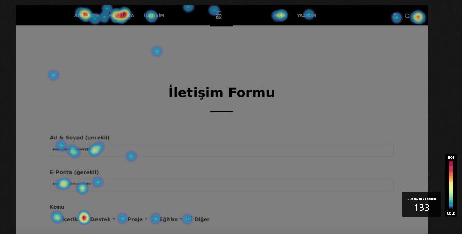
2. False-Click Check
On the click map, look at areas that are clicked but not clickable. If users click an image, a heading, or bold text, they think it is a button. Meet that expectation by either making the element genuinely clickable or removing its clickable appearance. The reverse also holds: real buttons staying cold means they do not look like buttons.
3. Error-Signal Check
Rage clicks and dead clicks are the highest-priority items because they point directly to a broken experience.
- Rage click: a user clicking the same spot repeatedly in frustration within a short time. Usually a sign of a non-working element, a frozen interface, or a slow-loading action.
- Dead click: a click on an area that produces no response. An element looks clickable but is not.
Both signals are auto-labeled in modern tools.2 When one shows up, watch the session recording of those sessions for the root cause. The heatmap tells you where it happened; watching the recording shows you why.
4. Reading-Pattern Check
On long text pages, move and scroll maps often produce an F-pattern: users scan the top rows horizontally, the left edge vertically, and ignore the bottom right. According to Nielsen Norman Group’s eyetracking research, the F-pattern is the result of unscannable content, not bad design; with no strong visual cue, the eye takes the path of least effort.3 If a critical message stays cold in the bottom-right region, move it to the top-left alignment or onto the horizontal bars of the F.

But F is not the only pattern. NN/g eyetracking studies define four patterns in text scanning; which one you see on your map tells you how scannable the content is.4
| Pattern | How it looks on the map | What it means |
|---|---|---|
| F-pattern | Horizontal at top, vertical on left | Unformatted wall of text; least efficient |
| Spotted | Scattered, clustered hotspots | User hunting for links/numbers/keywords |
| Layer-cake | Horizontal bands at heading lines | Headings are scannable; most efficient |
| Commitment | Almost every line hot | High motivation; genuine reading |
Practical takeaway: if you see an F on your map, your content is unformatted. The goal is to turn it into a layer-cake, so the eye can jump from heading to heading and read the section it cares about. You achieve this with descriptive, distinct headings and summary/bullet structures placed between sections.
Although the F-pattern is more than a decade old, the topic is not closed; 2024-2025 studies revisit the same question with deep learning. One study builds a model that predicts both saliency (heat) and scanpath (gaze order) from data collected as 41 participants freely browsed 450 web pages, and shows the model generalizes to posters, comics, and mobile interfaces.5 Another measures that as cognitive load rises, the attention a user gives to interface elements drops, but dynamic highlighting keeps drawing attention even under that load.6 Their shared message: a heat map is not random, it is shaped by the content’s visual hierarchy and the user’s load at that moment.
The same density logic is not specific to web interfaces either. Customer flow in a retail store, event frequency across a geography, or ball position in a match are all read with the same color coding; so the reading reflex you build in one context carries over to another.


5. Depth and Threshold Check
On the scroll map, the horizontal lines where color drops sharply are “reading thresholds.” The point where half the users leave can be a design problem, not a content problem. If the threshold coincides with a large gap that makes the page look finished, or with the end of a section, the user mistakenly thinks the page has ended. This is called a false bottom. It is solved by adding a continuation cue at section transitions (a half-visible image, a clipped heading).
The Four Cases Where Heatmaps Mislead You
Most guides describe the heatmap as a flawless source of truth. In practice, a heatmap is a tool that produces wrong decisions when read wrong. Do not trust any map without checking these four traps.
1. Low sample. This is the trap people fall into most: opening a heatmap on a low-traffic page and deciding with a few days of data. Under a few hundred sessions, a heatmap is just noise; a single curious user’s browsing can paint the map red. Wait for enough sessions to accumulate per page for a meaningful pattern; on low-traffic pages, watching individual session recordings is more honest than a heatmap.
2. Segment averaging. If a single map blends mobile and desktop users, the resulting heat is no one’s real behavior; it is the average of two different audiences. Always read device, traffic-source, and new/returning user breakdowns separately.
3. Dynamic content shift. If element positions change per user (personalized blocks, A/B variants, a cookie banner, rotating campaigns), the heatmap can show the wrong area as hot because it collects coordinate-based data. On dynamic pages, prefer tools that offer element-level heatmaps.
4. Breakpoint mixing. On a responsive page, if a wide desktop and a narrow mobile viewport are pooled into the same map, you get a picture that is correct for no width. Read each major breakpoint separately.
From Heatmap to Action
Spotting a pattern is a hypothesis, not evidence. What a heatmap can say on its own is limited, because it shows what happened, not why. A solid flow works like this:
- Find the pattern with the heatmap. “The CTA button is colder than expected.”
- Confirm the cause with session recording. Watch sessions that ignore that button; is it below the fold, or is the page loading slowly?
- Test the hypothesis with an A/B test. Build a variant that moves the button up, and measure.
- Confirm the result with the heatmap again. Did the heat shift to the expected place in the new variant?
The heatmap is the first step of this loop, not all of it. Looking at a single map and changing the design means deciding without confirming the cause; most of the time you solve the wrong problem.
Which Tool Should You Read It With?
All three common tools offer every one of these maps; the differences show up in the reading experience and in data ownership.
| Need | Suitable tool |
|---|---|
| Free and unlimited start | Clarity |
| Fast setup, survey integration | Hotjar |
| Self-host, data ownership, element-level heatmap | PostHog |
For the full tool comparison, free-tier limits, and the KVKK self-host argument, see the comparison table in the behavioral analytics guide.
Because constantly switching between the three map types is tiring, some tools (Contentsquare, for example) offer zoning maps that combine click, scroll, and move data in a single view.2 Zone-based reading answers “is this section both seen and clicked” without opening three maps side by side; it is faster than reading maps one by one but is still subject to the same traps (sample, segment, dynamic content).
Conclusion
A heatmap is a powerful tool, but only when read with the right question, enough sample, and the right segment. Read patterns, not colors; confirm the pattern with session recording; test the hypothesis with an A/B test. A heatmap tells you where to look, not what to do. That decision is made by comparing expectation against reality.
I build heatmap interpretation, session recording, and data-driven CRO architecture under the DNOMIA umbrella, tailored to your industry and KVKK requirements.
Request an architecture reviewFootnotes
- The complete guide to website heatmaps. Hotjar ↩
- Heatmap Analysis: 5 Strategies For Quick Results. Contentsquare ↩ ↩2
- F-Shaped Pattern of Reading on the Web. Nielsen Norman Group. The original research was done in 2006 and re-validated with eyetracking in 2017. ↩
- Text Scanning Patterns: Eyetracking Evidence. Nielsen Norman Group. Four patterns: F-pattern, spotted, layer-cake, commitment. For layer-cake, also see The Layer-Cake Pattern of Scanning Content on the Web. ↩
- Predicting Visual Attention in Graphic Design Documents. arXiv:2407.02439, 2024. 41 participants, 450 web pages; a two-stage deep learning model that surpasses existing models in saliency and scanpath prediction and generalizes to posters/comics/mobile interfaces. ↩
- Shifting Focus with HCEye: Visual Highlighting and Cognitive Load on Saliency Prediction. arXiv:2404.14232, 2024. 27 participants, 150 web pages; as cognitive load rises attention drops, but dynamic highlighting keeps drawing attention, and saliency models improve when they account for load. ↩
- 01 Reading a heatmap means reading patterns, not colors; pick the question first, then the map type.
- 02 Click maps measure intent, move maps measure interest, scroll maps measure content depth; each answers a different question.
- 03 Rage clicks and dead clicks are direct UX-error signals; they are the highest-priority action items.
- 04 Heatmaps mislead on low samples, mixed segments, and dynamic content; check these three traps.
- 05 A heatmap shows what happened, not why; confirm the why with session recording.
+ How do you read a heatmap?
Reading a heatmap means interpreting patterns, not colors. First decide which question you want to answer, then pick the right map type: click map for taps, move map for interest distribution, scroll map for content depth. Compare hot areas against your expectation; if there is no heat where you expected it, the element is either unseen or unappealing.
+ What is the difference between a click map, a move map, and a scroll map?
A click map shows where users click and measures action intent. A move map tracks mouse movement and roughly indicates where interest concentrates, but it is not a true proxy for eye movement. A scroll map shows how much of the page is seen, layer by layer, telling you what fraction of the content is read.
+ What do rage clicks and dead clicks mean?
A rage click is when a user clicks the same spot repeatedly in frustration within a short time; it usually signals a broken element or a frozen interface. A dead click is a click on an area that gives no response; an element looks clickable but is not. Both are direct UX-error signals.
+ When does heatmap data mislead?
On low samples (under a few hundred sessions) a heatmap is just noise. It also blends mobile and desktop behavior when all segments are averaged into one map, and on dynamic content it shows the wrong area as hot because of position shifts. Always read a heatmap with enough sample, segment separation, and a single breakpoint.